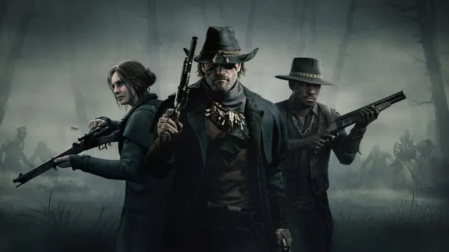
Crytek's grungy horror extraction shooter, Hunt: Showdown, has just experienced its biggest update in years. The 1896 update has brought a host of significant changes, including an engine upgrade, a complete UI overhaul, the addition of a fourth map named Mammon's Gulch, and other impactful tweaks. The update was so extensive that the game was even rebranded as Hunt: Showdown 1896.
The game's popularity soared following the update, with a record-breaking 59,968 concurrent players on its first day—an 18,000-player increase over its previous peak in October 2023. At the time of writing, over 51,000 players are actively engaged, chasing the new Hellborn boss or being immolated by it. By these metrics, Hunt: Showdown is more popular than ever.
However, this surge in player activity comes with a downside. The update has also sparked a wave of negative reviews on Steam—3,730 so far—that have pushed the game’s short-term review status to "Mostly Negative." This is a sharp contrast to its "Mostly Positive" long-term rating. The primary source of contention? The new pre-match UI.
Many players have expressed frustration with the new UI, claiming that it is less intuitive and requires significantly more clicks to navigate than the previous version. User Shinigaben commented, "Looks fancy but is a nightmare to navigate... You need 3 or so clicks per action more than the old UI and it also just gives way less information on one screen without switching between various submenus."
The new UI features a horizontal list or grid for Hunter selection, a significant departure from the vertical list that players were accustomed to. The changes have led some players to speculate that the UI was redesigned with console players in mind, given its larger icons and the perceived lack of keyboard input support. It’s worth noting that the new version of Hunt: Showdown was launched concurrently on PC, PS5, and Xbox Series X/S, which might explain some of these compromises.
Additionally, some players accuse Crytek of redesigning the UI to push microtransactions to the forefront, comparing it to the monetization strategies seen in games like Fortnite and Call of Duty: Warzone. However, others, including longtime players, argue that Hunt’s monetization remains relatively unobtrusive compared to other service games.
The complaints aren’t limited to the UI, though. Some players have reported that the update has introduced new performance issues, with one user, Sloppy Steaks, noting, "With the update my performance has dropped to a level where I cannot play without stutters." Others have mentioned bugs and a perceived decline in visual quality, though these issues seem to be mentioned far less frequently than the UI complaints.
Despite these grievances, the update has not been universally panned. Some reviews praise the overall content of the update while simultaneously criticizing the UI. User Sir Fluffy McDuck remarked, "New engine update has made the game itself much smoother for me. New map is really nice too. I like the increased verticality... HOWEVER, this new menu UI is such a pain."
So, can a menu UI really be so bad that it ruins the experience of playing? Or is this another example of the PC gaming community fixating on a specific aspect of a game that resonates in comment threads? Reddit user Redwood-Lynx certainly thinks so, expressing bewilderment over the "bizarre reaction" to what they consider "amazing content."
From our own experience with the update, the new UI does introduce some discomfort, particularly for those accustomed to the old layout. Some actions now require more input, and a few, like picking different life bar segments for your hunter, have become smoother. However, the UI is just one part of the 1896 update, and the backlash seems to overshadow the broader, more positive aspects of the update.
Leave a Reply